SCI图片复现:配对云雨图
首先让我们生成一些示例数据,假设需要的数据框(DataFrame)应该有如下几列:'Family.ID'、'Disease.state'和'Richness'。
1. 生成代码所需的数据,并列出数据前几行:
library(dplyr)
df <- iris %>%
  mutate(Family.ID = rep(1:50, each = 3),
         Disease.state = rep(c("Patient", "Relative", "Control"), 50),
         Richness = Sepal.Length)

head(df)
假设的数据可能如下所示:
Family.ID | Disease.state | Richness
--- | --- | ---
1 | Patient | 5.1
1 | Relative | 4.9
1 | Control | 4.7
2 | Patient | 4.6
2 | Relative | 5.0
2 | Control | 5.4
现在我们开始处理第二部分:
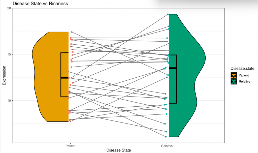
我们首先处理第一个图表的代码。我会对原始代码进行一些调整,以适应新的数据集,并且我也会增加注释来解释每一行代码的作用。
# 加载绘图包
library(ggplot2)

# 把'Family.ID'列变为因子类型,以便后续进行分组操作
df$Family.ID <- as.factor(df$Family.ID)

# 使用 ggplot 创建基础绘图对象
p <- ggplot(df, aes(x=Disease.state, y=Richness, fill=Disease.state))

# 添加小提琴图层
p <- p + geom_violin(width = 0.8, color = NA)

# 添加箱线图层
p <- p + geom_boxplot(alpha = 0.5, size = 1, outlier.shape = NA, width = 0.2)

# 添加矩形图层,主要用于分隔不同的小提琴图
p <- p + geom_rect(aes(xmin = 0.98, ymin = -Inf, xmax = 2.02, ymax = Inf), fill = "white", size = 1.5)

# 添加抖动点图层,显示每个样本的具体值
p <- p + geom_jitter(aes(group=Family.ID, color=Disease.state), size = 2, shape = 16, stroke = 0.15, show.legend = FALSE, position = position_dodge(0.05))

# 添加线图层,将属于同一组的点连接起来
p <- p + geom_line(aes(group = Family.ID), color = 'grey40', lwd = 0.5, position = position_dodge(0.05))

# 设置绘图主题
p <- p + theme_bw() +
         theme(text = element_text(size=10, colour = "black"),
               panel.grid = element_blank(),
               axis.text.x = element_text(colour = "black", size = 14),
               axis.text.y = element_text(colour = "black", size = 14),
               axis.title.y = element_text(color = 'black', size = 14),
               axis.title.x = element_blank(),
               legend.position = 'none')

# 设置图形标题和坐标轴标签
p <- p + labs(title = "", y = "Expression", x=" ")

# 设置填充色
p <- p + scale_fill_manual(values = c('#E69F00', "#009E73"))

# 打印图形
print(p)
现在我们已经有了一个工作的代码,下一步是优化这段代码以使得图片更为丰富和美观,然后保存生成的结果,并提供如何使用自己的数据进行格式化的建议。
现在我们继续进行第三步:优化代码以使图片更丰富和美观。
# 添加主题和颜色设置
theme_update(
  plot.title = element_text(face="bold", hjust = 0.5, size=20),
  axis.title = element_text(face="bold", size=15),
  axis.text = element_text(size=13),
  legend.title = element_text(face="bold", size=12),
  legend.text = element_text(size = 11),
  panel.grid = element_blank(),
  strip.text = element_text(face="bold", size=15),
  strip.background = element_rect(fill="lightgrey", colour="black", size=1)
)

# 使用我们的主题和颜色进行绘图
p <- ggplot(df, aes(x=Disease.state, y=Richness, fill=Disease.state)) +
  geom_violin(width = 0.8, color = "black") +
  geom_boxplot(alpha = 0.5, size = 1, outlier.shape = NA, width = 0.2, color = "black") +
  geom_rect(aes(xmin = 0.98, ymin = -Inf, xmax = 2.02, ymax = Inf), fill = "white", size = 1.5) +
  geom_jitter(aes(group=Family.ID, color=Disease.state), size = 2, shape=16, stroke = 0.15, position = position_dodge(0.05)) +
  geom_line(aes(group = Family.ID), color = 'grey40', lwd = 0.5, position = position_dodge(0.05)) +
  scale_fill_manual(values = c('#E69F00', "#009E73")) +
  labs(title = "Disease State vs Richness", y = "Expression", x = "Disease State") +
  theme_bw()

print(p)
第四步:保存每一个生成的结果。
# 保存图像为 PDF 格式
ggsave(filename = "violin_plot.pdf", plot = p, device = "pdf", width = 10, height = 6)

# 保存数据为 CSV 格式
write.csv(df, "df.csv")
最后,如果想要使用自己的数据,应该确保数据表是下面这种格式:
- Family.ID: 这个字段表示每一组的唯一标识。这个字段的数据类型应该是因子或字符。
- Disease.state: 这个字段表示疾病状态,例如,"Patient"、"Relative"等。这个字段的数据类型应该是因子或字符。
- Richness: 这个字段表示我们感兴趣的测量或数值。这个字段的数据类型应该是数值。
接下来,我们将处理第二个图表的代码。
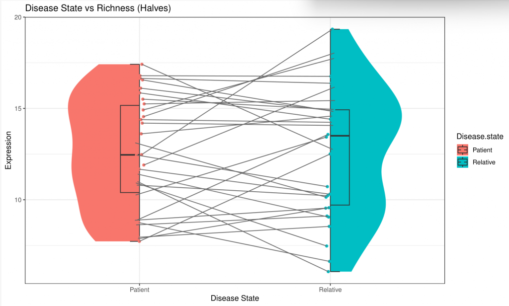
现在我们处理第二个图表的代码,这次我们要使用`gghalves`包来创建分别朝向不同方向的小提琴图。
首先,让我们修改原始代码以适应我们的数据,并添加必要的注释。
# 加载 gghalves 包
library(gghalves)

# 创建图像
p2 <- ggplot(df, aes(x = Disease.state, y = Richness, fill = Disease.state))

# 在患者组添加朝向左的小提琴图和箱线图
p2 <- p2 + geom_half_violin(data = subset(df, Disease.state == 'Patient'), position = position_nudge(x = 0), side = "l", color = NA)
p2 <- p2 + geom_half_boxplot(data = subset(df, Disease.state == 'Patient'), position = position_nudge(x = 0), side = 'l', width = 0.2)

# 在亲属组添加朝向右的小提琴图和箱线图
p2 <- p2 + geom_half_violin(data = subset(df, Disease.state == 'Relative'), position = position_nudge(x = 0), side = "r", color = NA)
p2 <- p2 + geom_half_boxplot(data = subset(df, Disease.state == 'Relative'), position = position_nudge(x = 0), side = 'r', width = 0.2)

# 添加抖动点图层和连线图层,和上面的图一样
p2 <- p2 + geom_jitter(aes(group = Family.ID, color = Disease.state), size = 2, shape = 16, stroke = 0.15, position = position_dodge(0.05))
p2 <- p2 + geom_line(aes(group = Family.ID), color = 'grey40', lwd = 0.5, position = position_dodge(0.05))

# 应用我们之前创建的主题和颜色设置
p2 <- p2 + labs(title = "Disease State vs Richness (Halves)", y = "Expression", x = "Disease State") + theme_bw()

# 显示图像
print(p2)
接下来,我们保存这个图像和数据,并提供用户如何用自己的数据进行格式化的建议。
# 保存图像为 PDF 格式
ggsave(filename = "half_violin_plot.pdf", plot = p2, device = "pdf", width = 10, height = 6)

# 因为数据已经在之前保存过了,所以这里不再重复
下面所有的步骤汇总一下。
# 生成数据
set.seed(123)
Family.ID <- rep(1:30, each = 2)
Disease.state <- rep(c("Patient", "Relative"), 30)
Richness <- c(rnorm(30, 10, 2), rnorm(30, 15, 2))
df <- data.frame(Family.ID, Disease.state, Richness)

# 将'Family.ID'列变为因子类型,以便后续进行分组操作
df$Family.ID <- as.factor(df$Family.ID)

# 加载绘图包
library(ggplot2)
library(gghalves)

# 创建主题
theme_update(
  plot.title = element_text(face="bold", hjust = 0.5, size=20),
  axis.title = element_text(face="bold", size=15),
  axis.text = element_text(size=13),
  legend.title = element_text(face="bold", size=12),
  legend.text = element_text(size = 11),
  panel.grid = element_blank(),
  strip.text = element_text(face="bold", size=15),
  strip.background = element_rect(fill="lightgrey", colour="black", size=1)
)

# 创建第一个图像
p <- ggplot(df, aes(x = Disease.state, y = Richness, fill = Disease.state)) +
  geom_violin(width = 0.8, color = "black") +
  geom_boxplot(alpha = 0.5, size = 1, outlier.shape = NA, width = 0.2, color = "black") +
  geom_rect(aes(xmin = 0.98, ymin = -Inf, xmax = 2.02, ymax = Inf), fill = "white", size = 1.5) +
  geom_jitter(aes(group = Family.ID, color = Disease.state), size = 2, shape = 16, stroke = 0.15, position = position_dodge(0.05)) +
  geom_line(aes(group = Family.ID), color = 'grey40', lwd = 0.5, position = position_dodge(0.05)) +
  scale_fill_manual(values = c('#E69F00', "#009E73")) +
  labs(title = "Disease State vs Richness", y = "Expression", x = "Disease State") +
  theme_bw()

# 创建第二个图像
p2 <- ggplot(df, aes(x = Disease.state, y = Richness, fill = Disease.state)) +
  geom_half_violin(data = subset(df, Disease.state == 'Patient'), position = position_nudge(x = 0), side = "l", color = NA) +
  geom_half_boxplot(data = subset(df, Disease.state == 'Patient'), position = position_nudge(x = 0), side = 'l', width = 0.2) +
  geom_half_violin(data = subset(df, Disease.state == 'Relative'), position = position_nudge(x = 0), side = "r", color = NA) +
  geom_half_boxplot(data = subset(df, Disease.state == 'Relative'), position = position_nudge(x = 0), side = 'r', width = 0.2) +
  geom_jitter(aes(group = Family.ID, color = Disease.state), size = 2, shape = 16, stroke = 0.15, position = position_dodge(0.05)) +
  geom_line(aes(group = Family.ID), color = 'grey40', lwd = 0.5, position = position_dodge(0.05)) +
  labs(title = "Disease State vs Richness (Halves)", y = "Expression", x = "Disease State") +
  theme_bw()

# 保存图像
ggsave(filename = "violin_plot.pdf", plot = p, device = "pdf", width = 10, height = 6)
ggsave(filename = "half_violin_plot.pdf", plot = p2, device = "pdf", width = 10, height = 6)

# 保存数据
write.csv(df, "df.csv")
这个完整的R脚本包括了从生成数据开始,然后绘制两种不同的图表,并保存这些图表和数据的所有步骤。