SCI图片复现:批量散点柱状图
代码是做一系列的基因表达量的箱线图并进行了分组的t检验。需要两个CSV文件,一个是 "Exp.csv",它应该包含表达量数据,另一个是 "info.csv",它应该包含样本信息。
1. 生成模拟数据
# 设置工作目录
setwd("")

# 设定随机数种子以确保可重复性
set.seed(123)

# 生成模拟数据
Exp <- matrix(runif(200), nrow=20)
colnames(Exp) <- c("CD28","CD3D","CD8A","LCK","GATA3","EOMES","IL23A","CXCL8","IL1R2","IL1R1")
rownames(Exp) <- paste0("Sample_", 1:20)

# 生成样本信息
info <- data.frame(Sample = rownames(Exp),
                   Type = sample(c("Asymptomatic","Mild","Severe","Critical"), 20, replace = TRUE))

# 保存数据
write.csv(Exp, "Exp.csv", row.names = TRUE)
write.csv(info, "info.csv", row.names = FALSE)

# 检查生成的数据
head(Exp)
head(info)
2. 修改代码以适应生成的数据
因为模拟数据已经是正态分布,我们不需要执行对数转换。
# 读取模拟数据
Exp <- read.csv("Exp.csv",header=T,row.names=1)
info <- read.csv("info.csv",header=T)

# 需要作图的基因
gene <- c("CD28","CD3D","CD8A","LCK","GATA3","EOMES","IL23A","CXCL8","IL1R2","IL1R1")
gene <- as.vector(gene)
Exp_plot <- Exp[,gene]

# 调整样本信息的顺序以匹配表达数据的顺序
info$Sample <- factor(info$Sample, levels = rownames(Exp_plot))
info <- info[order(info$Sample),]

# 根据样本信息调整表达数据的顺序
Exp_plot <- Exp_plot[info$Sample,]
Exp_plot$sam <- info$Type
Exp_plot$sam <- factor(Exp_plot$sam,levels=c("Asymptomatic","Mild","Severe","Critical"))

# 然后跟随你的代码进行图形生成和可视化...
3. 代码优化及注释
# 定义颜色
col <-c("#5CB85C","#337AB7","#F0AD4E","#D9534F")
# 定义所有比较组
groups <- c("Asymptomatic","Mild","Severe","Critical")
comparisons <- combn(groups, 2, simplify = FALSE)
# 初始化列表来保存图形
plist2 <- list()
# 针对每个基因生成箱线图并进行t检验
for (i in 1:length(gene)) {
# 提取基因表达信息
bar_tmp <- Exp_plot[,c(gene[i],"sam")]
colnames(bar_tmp) <- c("Expression","sam")
# 生成并修改箱线图
pb1 <- ggboxplot(bar_tmp, x = "sam", y = "Expression", color = "sam", add = "jitter",
bxp.errorbar.width = 0.6, width = 0.4, size = 0.01,
font.label = list(size = 30), palette = col) +
theme(panel.background = element_blank(),
axis.line = element_line(colour = "black"),
axis.title.x = element_blank(),
axis.title.y = element_blank(),
axis.text.x = element_text(size = 15, angle = 45, vjust = 1, hjust = 1),
axis.text.y = element_text(size = 15),
plot.title = element_text(hjust = 0.5, size = 15, face = "bold"),
legend.position = "none") +
ggtitle(gene[i]) +
stat_compare_means(method = "t.test", hide.ns = F, comparisons = comparisons, label = "p.signif")
# 保存图形
plist2[[i]] <- pb1
}
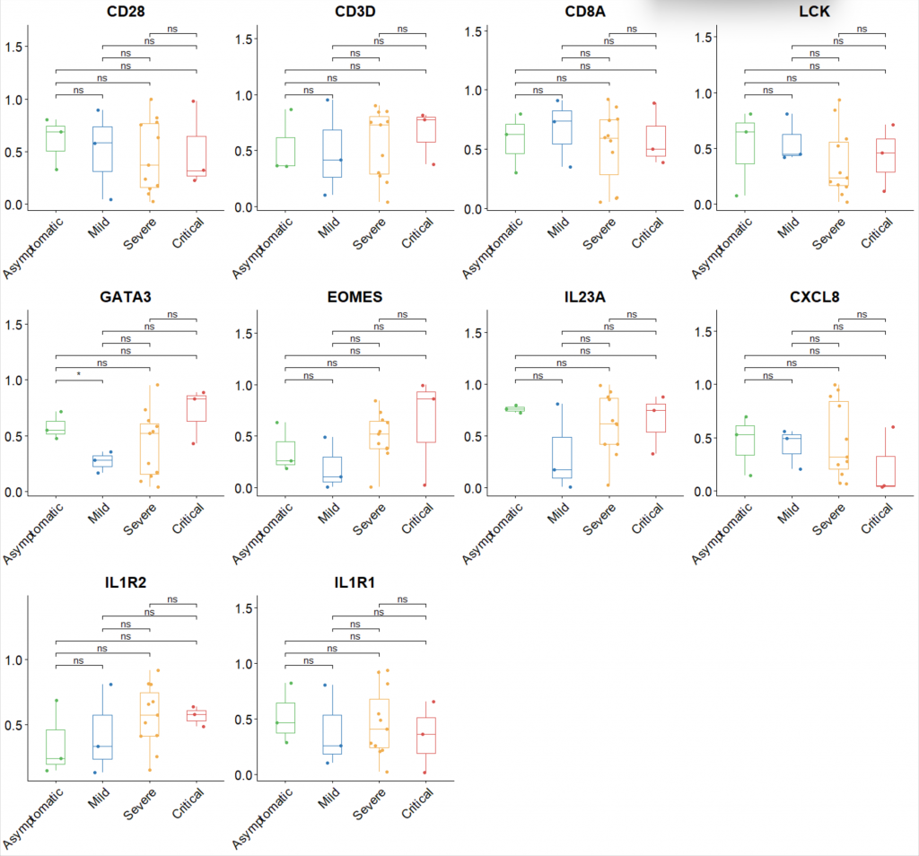
# 将所有图形组合到一个图中
pall <- plot_grid(plotlist = plist2, ncol = 4)
pall
4. 优化图片的美观度
# 更新主题以优化图形美观度
pb1 <- pb1 + theme_classic() +  # 使用经典主题
  theme(
    axis.text.x = element_text(size = 15, angle = 45, vjust = 1, hjust = 1, color = "black"),
    axis.text.y = element_text(size = 15, color = "black"),
    axis.title = element_text(size = 16, face = "bold"),
    plot.title = element_text(hjust = 0.5, size = 18, face = "bold", color = "black"),
    legend.title = element_text(size = 14, face = "bold"),
    legend.text = element_text(size = 12)
  )
5. 保存生成的结果
# 保存图像为 PDF 格式
ggsave("boxplots.pdf", pall, width = 10, height = 10)

# 保存数据为 CSV 格式
write.csv(Exp_plot, "Exp_plot.csv", row.names = TRUE)
完整代码
# 加载必要的包
library(RColorBrewer)
library(ggpubr)
library(ggplot2)
library(cowplot)


# 设定工作目录
setwd("C:/Users/赖龙/Desktop")

# 设定随机数种子以确保可重复性
set.seed(123)

# 生成模拟数据
# 生成模拟数据
Exp <- matrix(runif(200), nrow=20, ncol=10) # 注意这里的 ncol 参数,确保你有12列
colnames(Exp) <- c("CD28","CD3D","CD8A","LCK","GATA3","EOMES","IL23A","CXCL8","IL1R2","IL1R1")
rownames(Exp) <- paste0("Sample_", 1:20)

# 生成样本信息
info <- data.frame(Sample = rownames(Exp),
                   Type = sample(c("Asymptomatic","Mild","Severe","Critical"), 20, replace = TRUE))

# 保存模拟数据
write.csv(Exp, "Exp.csv", row.names = TRUE)
write.csv(info, "info.csv", row.names = FALSE)

# 读取模拟数据
Exp <- read.csv("Exp.csv",header=T,row.names=1)
info <- read.csv("info.csv",header=T)

# 需要作图的基因
gene <- c("CD28","CD3D","CD8A","LCK","GATA3","EOMES","IL23A","CXCL8","IL1R2","IL1R1")
gene <- as.vector(gene)
Exp_plot <- Exp[,gene]

# 调整样本信息的顺序以匹配表达数据的顺序
info$Sample <- factor(info$Sample, levels = rownames(Exp_plot))
info <- info[order(info$Sample),]

# 根据样本信息调整表达数据的顺序
Exp_plot <- Exp_plot[info$Sample,]
Exp_plot$sam <- info$Type
Exp_plot$sam <- factor(Exp_plot$sam,levels=c("Asymptomatic","Mild","Severe","Critical"))

# 定义颜色
col <-c("#5CB85C","#337AB7","#F0AD4E","#D9534F")

# 定义所有比较组
groups <- c("Asymptomatic","Mild","Severe","Critical")
comparisons <- combn(groups, 2, simplify = FALSE)

# 初始化列表来保存图形
plist2 <- list()

# 针对每个基因生成箱线图并进行t检验
for (i in 1:length(gene)) {
  # 提取基因表达信息
  bar_tmp <- Exp_plot[,c(gene[i],"sam")]
  colnames(bar_tmp) <- c("Expression","sam")

  # 生成并修改箱线图
  pb1 <- ggboxplot(bar_tmp, x = "sam", y = "Expression", color = "sam", add = "jitter",
                   bxp.errorbar.width = 0.6, width = 0.4, size = 0.01,
                   font.label = list(size = 30), palette = col) +
    theme(panel.background = element_blank(),
          axis.line = element_line(colour = "black"),
          axis.title.x = element_blank(),
          axis.title.y = element_blank(),
          axis.text.x = element_text(size = 15, angle = 45, vjust = 1, hjust = 1, color = "black"),
          axis.text.y = element_text(size = 15, color = "black"),
          plot.title = element_text(hjust = 0.5, size = 18, face = "bold", color = "black"),
          legend.position = "none") +
    ggtitle(gene[i]) +
    stat_compare_means(method = "t.test", hide.ns = F, comparisons = comparisons, label = "p.signif")

  # 保存图形
  plist2[[i]] <- pb1
}

# 将所有图形组合到一个图中
pall <- plot_grid(plotlist = plist2, ncol = 4)

# 显示组合图
print(pall)

# 保存图像为 PDF 格式
ggsave("boxplots.pdf", pall, width = 10, height = 10)

# 保存数据为 CSV 格式
write.csv(Exp_plot, "Exp_plot.csv", row.names = TRUE)
阅读剩余
版权声明:
作者:
链接:https://yunshangtulv.com.cn/?p=482
文章版权归作者所有,未经允许请勿转载。
THE END