SCI图片复现:花瓣图
首先,我将生成一个数据框,并显示前几行。
# 假设数据需要有三个字段:case_id,KRAS_VAF,和group
case_id <- seq(1, 34)
KRAS_VAF <- runif(34, min = 0.1, max = 1)
group <- sample(c("#B84D64","#3D6AAA","#EE7072","tan1","#394D9B"), size = 34, replace = TRUE)

A <- data.frame(case_id, KRAS_VAF, group)

# 打印数据的前几行
head(A)
接着,我们来修改代码以适应新生成的数据,并对每一行进行解释:
# Load the required library
library(ggplot2)

# Begin the plot
p <- ggplot(A,aes(x=case_id, y=KRAS_VAF)) +
  # Add a bar plot layer
  geom_col(aes(fill=group),show.legend = FALSE, color='black') +
  # Convert the plot to polar coordinates
  coord_polar(direction = 1) +
  # Set the theme to black and white
  theme_bw() +
  # Remove unnecessary elements from the theme
  theme(axis.text.y = element_blank(),
        axis.ticks = element_blank(),
        panel.border = element_blank(),
        axis.title = element_blank(),
        axis.text.x = element_text(colour = 'black',size = 8),
        panel.grid = element_line(colour = 'black')) +
  # Set custom fill colors
  scale_fill_manual(values = c( "#B84D64","#3D6AAA","#EE7072","tan1","#394D9B"))

# Display the plot
print(p)
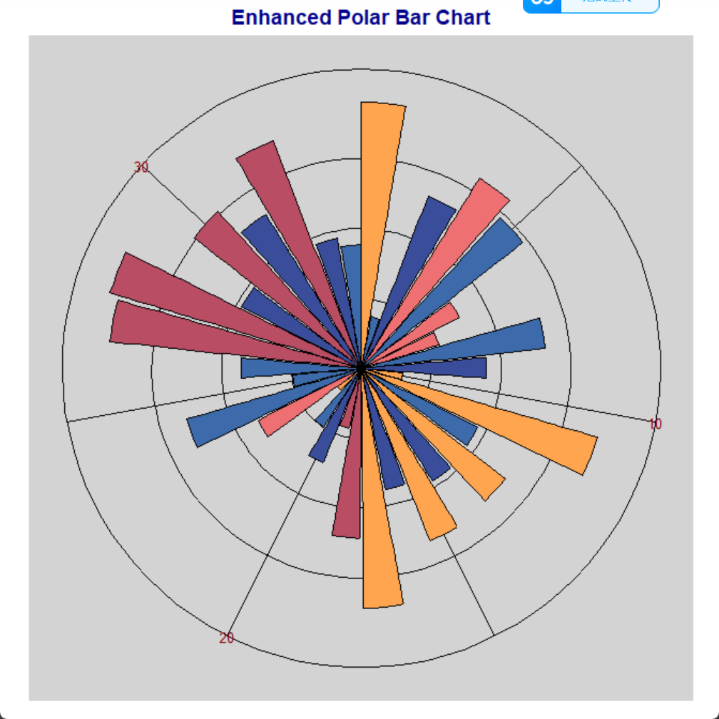
接下来,我们将对图形进行优化,以增加视觉吸引力:
p <- p +
  # Add a title
  ggtitle("Enhanced Polar Bar Chart") +
  # Improve theme
  theme(
    plot.title = element_text(hjust = 0.5, size = 14, face = "bold", color = "darkblue"),
    panel.background = element_rect(fill = "lightgrey"),
    axis.text.x = element_text(color = "darkred", size = 10)
  )

print(p)
然后,我们将结果保存为PDF格式的图像,数据保存为CSV格式:
# Save the plot
ggsave(filename = "polar_bar_chart.pdf", plot = p)

# Save the data
write.csv(A, "AABB.csv", row.names = FALSE)
对于使用自己的数据,数据表应采用以下格式:
- case_id: 整数,表示样本的唯一标识符
- KRAS_VAF: 数字,表示要在花瓣图中表示的数值
- group: 字符串,表示每个样本所属的组别。每个组别应对应一个特定的颜色值。
下面是完整代码
# Load the required library
library(ggplot2)

# Generate the data
case_id <- seq(1, 34)
KRAS_VAF <- runif(34, min = 0.1, max = 1)
group <- sample(c("#B84D64","#3D6AAA","#EE7072","tan1","#394D9B"), size = 34, replace = TRUE)

A <- data.frame(case_id, KRAS_VAF, group)

# Print the first few rows of the data
print(head(A))

# Begin the plot
p <- ggplot(A,aes(x=case_id, y=KRAS_VAF)) +
  # Add a bar plot layer
  geom_col(aes(fill=group),show.legend = FALSE, color='black') +
  # Convert the plot to polar coordinates
  coord_polar(direction = 1) +
  # Set the theme to black and white
  theme_bw() +
  # Remove unnecessary elements from the theme
  theme(axis.text.y = element_blank(),
        axis.ticks = element_blank(),
        panel.border = element_blank(),
        axis.title = element_blank(),
        axis.text.x = element_text(colour = 'black',size = 8),
        panel.grid = element_line(colour = 'black')) +
  # Set custom fill colors
  scale_fill_manual(values = c( "#B84D64","#3D6AAA","#EE7072","tan1","#394D9B"))

# Add enhancements to the plot
p <- p +
  # Add a title
  ggtitle("Enhanced Polar Bar Chart") +
  # Improve theme
  theme(
    plot.title = element_text(hjust = 0.5, size = 14, face = "bold", color = "darkblue"),
    panel.background = element_rect(fill = "lightgrey"),
    axis.text.x = element_text(color = "darkred", size = 10)
  )

# Print the plot
print(p)

# Save the plot
ggsave(filename = "polar_bar_chart.pdf", plot = p)

# Save the data
write.csv(A, "AABB.csv", row.names = FALSE)
阅读剩余
版权声明:
作者:
链接:https://yunshangtulv.com.cn/?p=477
文章版权归作者所有,未经允许请勿转载。
THE END